
2021 Halloween Display
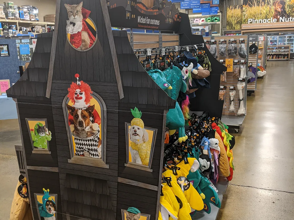
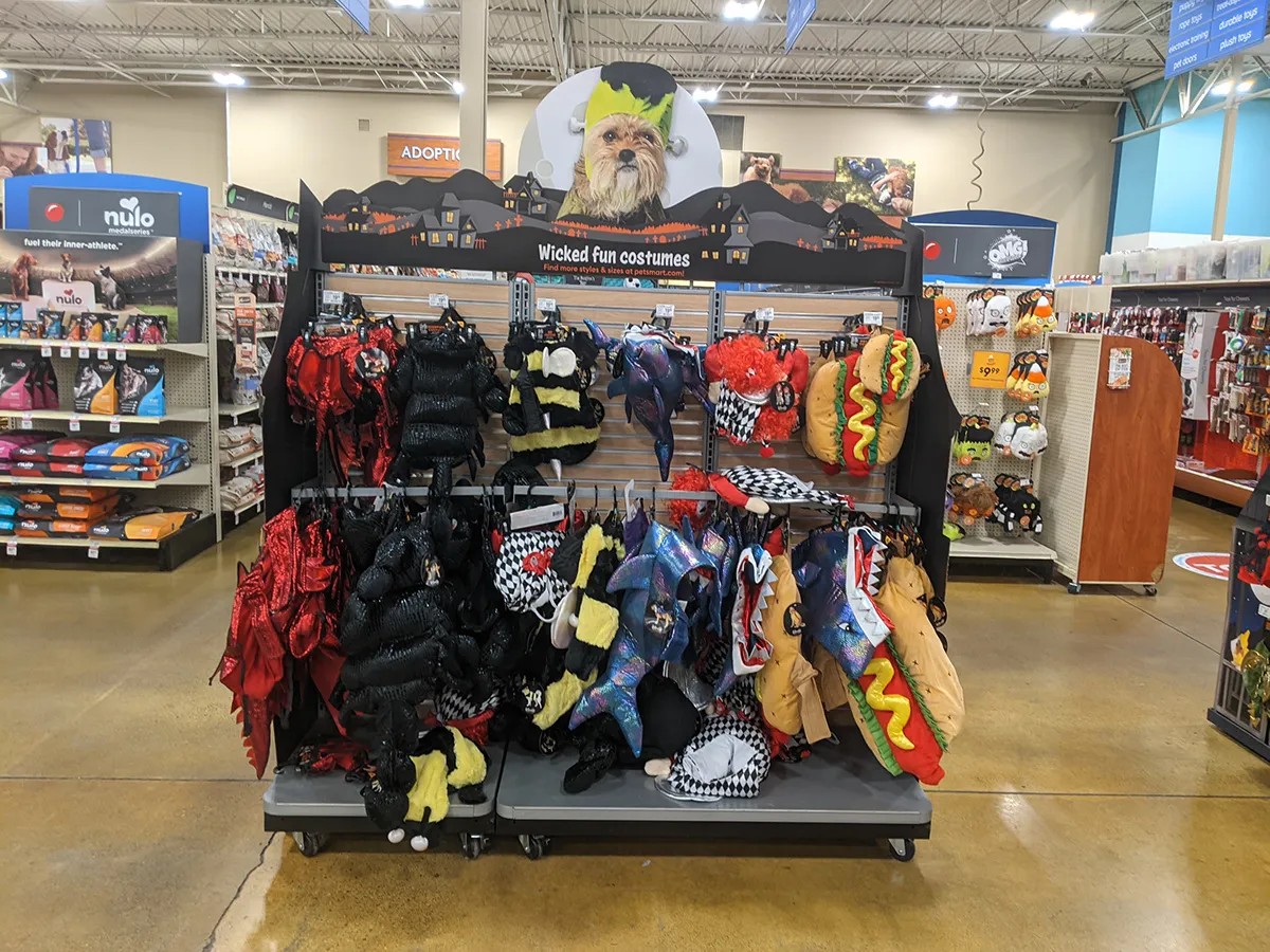
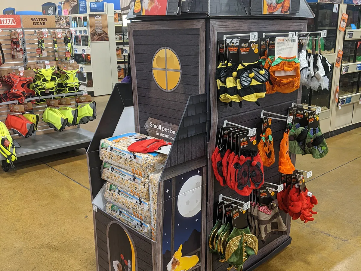
Evolution of PetSmart's flagship seasonal retail program, introducing 3D architectural overheads and modular floor merchandising.
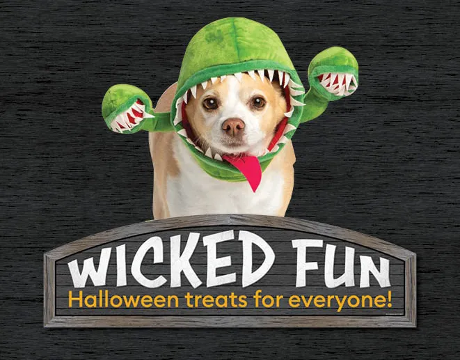
Retail & Merchandising
Displays, packaging, and endcaps that get noticed on a crowded shelf.
Retail Strategy
Retail creative must read instantaneously, command foot traffic, and maintain brand cohesion across physical store environments.
Project Details
Amanda's Role
Amanda led concept development, 3D visualization, large-format production graphics, and modular sign specifications across 1,600+ retail locations.
Challenge & Focus
Build on the success of previous seasonal activations by engineering a multi-dimensional display system that cut through noisy holiday store aisles and streamlined high-velocity product restocking.
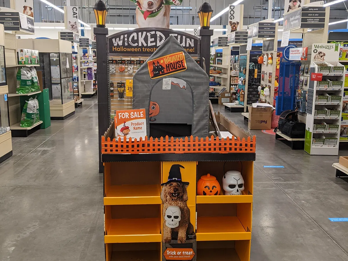
- 3D Architectural Header Signs
- Modular Restocking Floor Displays
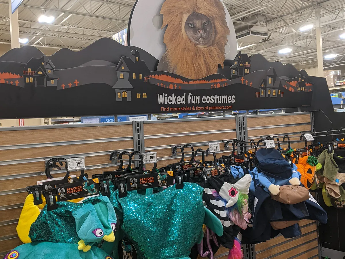
- Large-Format Dimensional Signage
- Nationwide Store Rollout Guide
Creative Concept & Execution
The theatrical energy starts in concept, but the real test is whether the aisle still feels shop-ready once the work becomes physical.
Outcome & Impact
A showstopping seasonal environment that unified apparel, toys, and treats under one cohesive aesthetic while driving double-digit category engagement.
Tools & Formats: 3D Architectural Header Signs · Modular Restocking Floor Displays · Large-Format Dimensional Signage · Nationwide Store Rollout Guide
Project Visuals & Rollout
From initial 3D concept visualization to full in-store fabrication, tracking how spatial design translates into physical retail.

Conceptual 3D Structural Rendering & Merchandising Endcap
Concept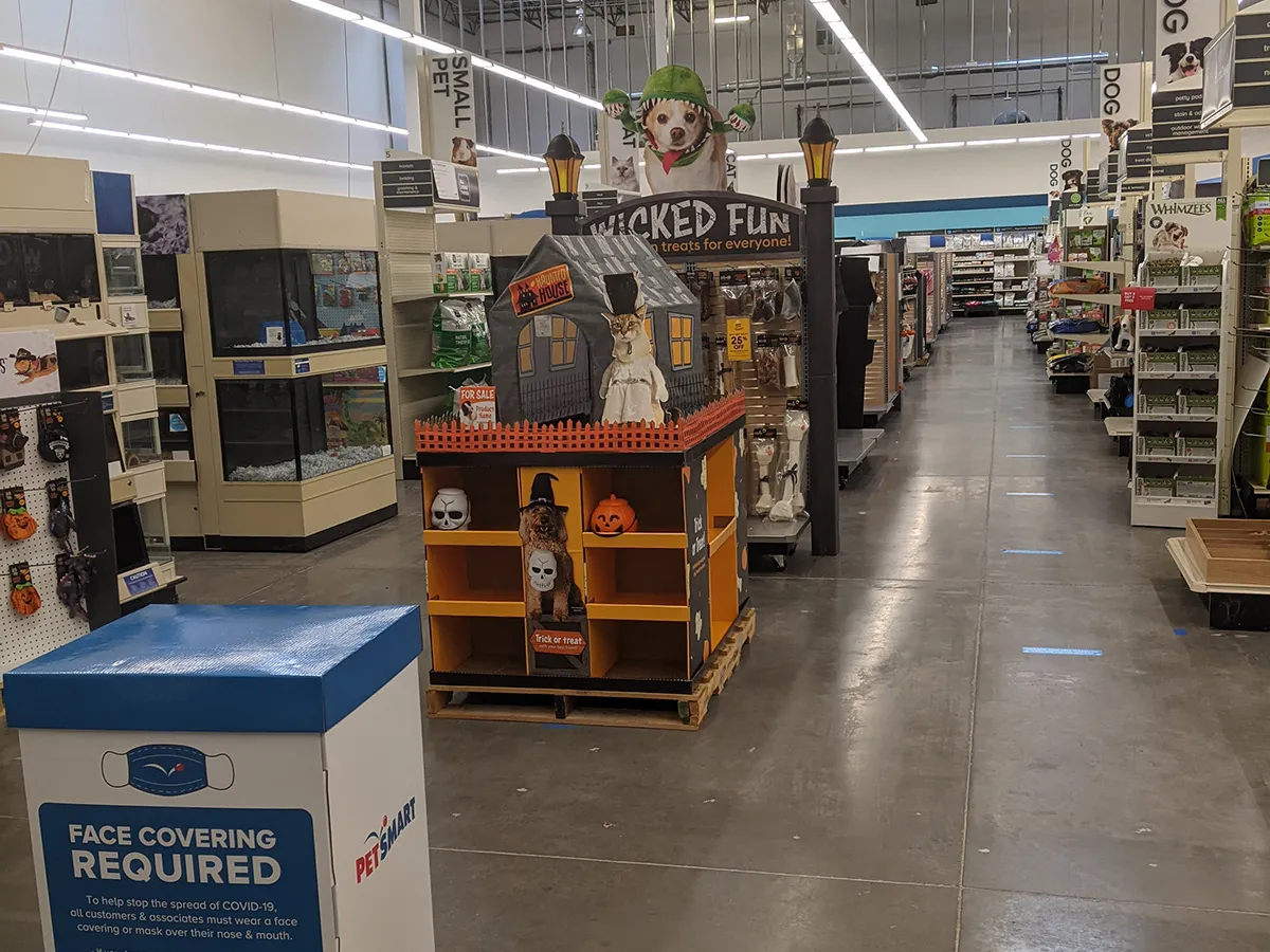
More for PetSmart

New Pet Place
An immersive retail department and adoption onboarding environment designed to guide first-time pet parents through essential care milestones.
Pride At Work
A nationwide Associate Resource Group campaign celebrating diversity, inclusion, and community across PetSmart stores and corporate offices.

Doggie Day Camp Playdates
Seasonal themed micro-events, promotional collateral, and personalized pawprint keepsakes driving PetSmart Doggie Day Camp trial.
Adjacent projects navigation
Planning a retail campaign or seasonal rollout?
Best for projects that live in real stores: tight deadlines, shelf constraints, and heavy visual competition.