
Annexus University
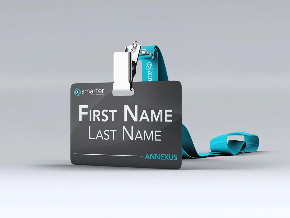
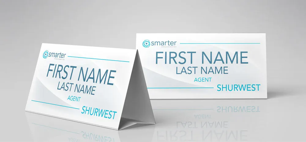
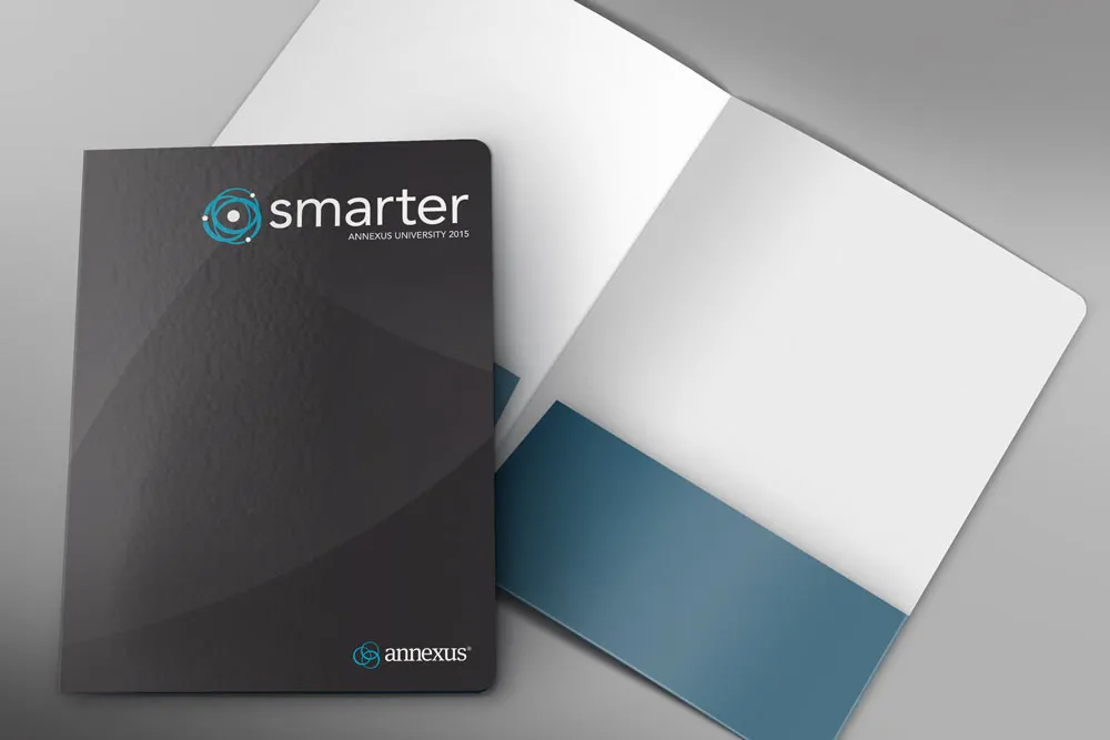
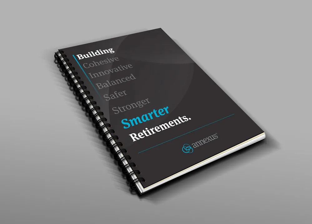
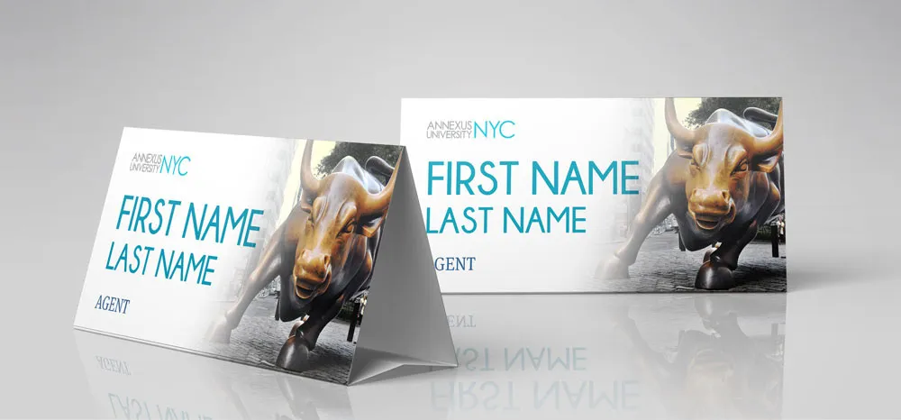
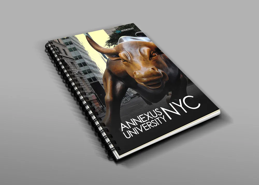
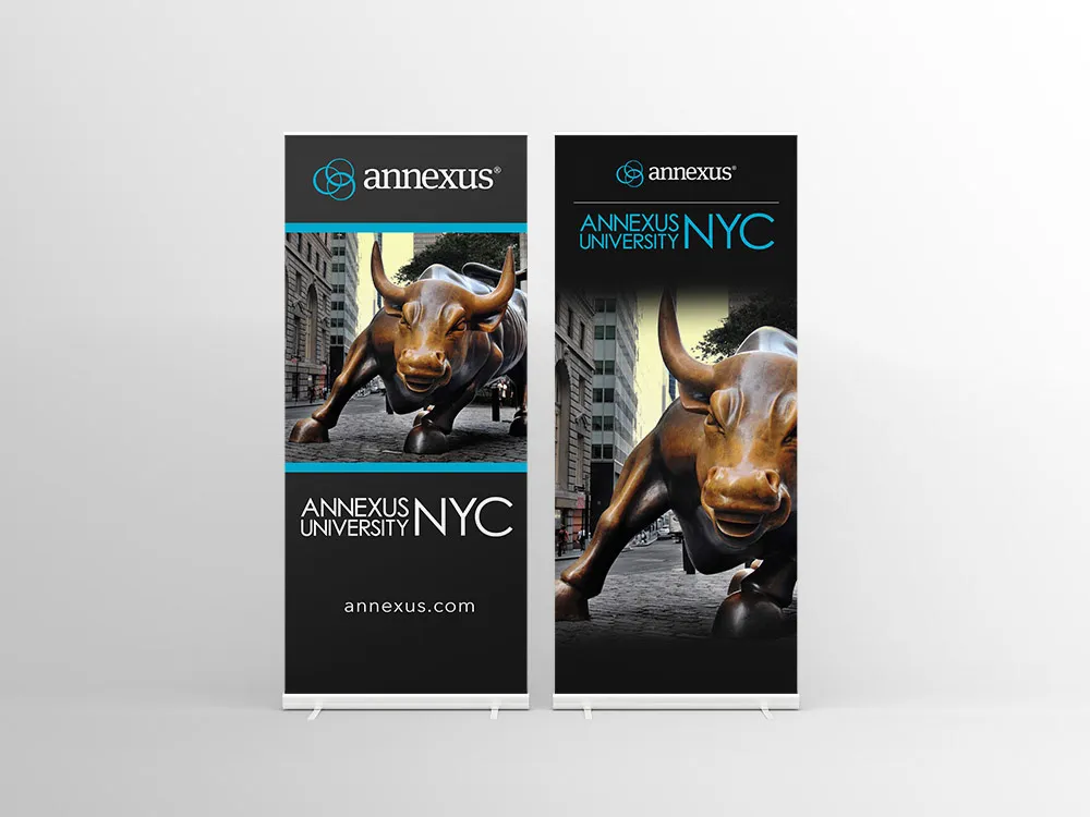
Comprehensive educational event branding, executive keynote presentation design, and attendee collateral for Annexus University.
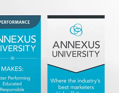
Presentations & Collateral
Pitch decks, keynotes, and print pieces that make dense ideas easy to follow.
Executive Storytelling
Presentation and event design organizes dense information with editorial discipline, ensuring complex ideas persuade and captivate audiences.
Project Details
Amanda's Role
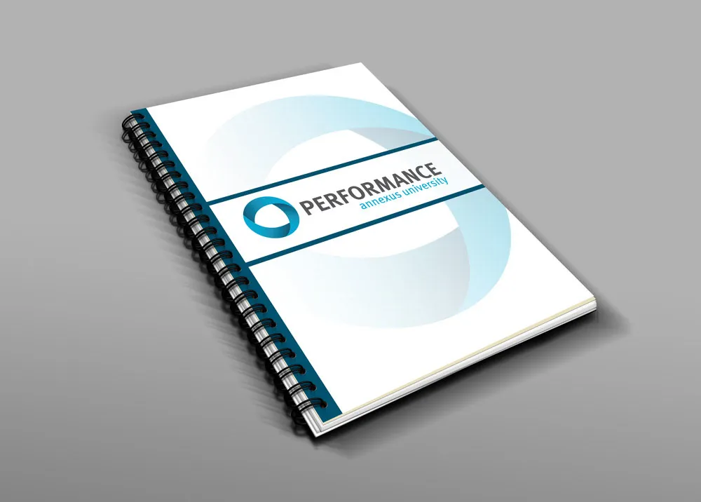
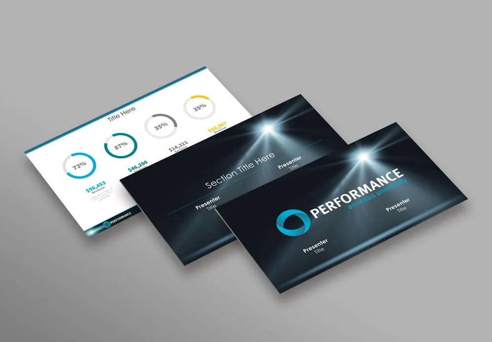
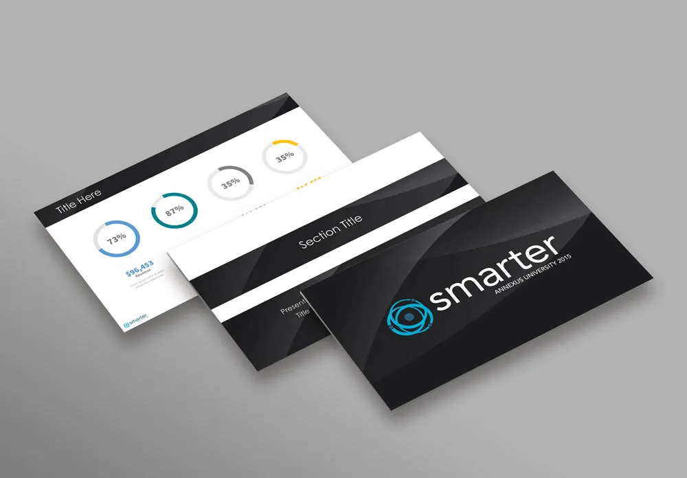
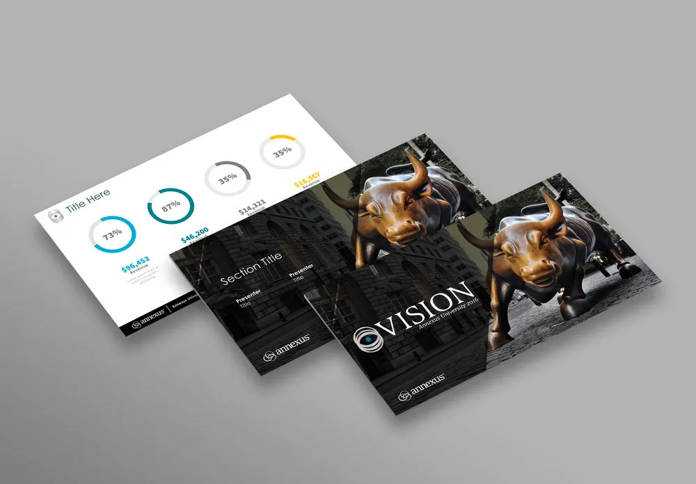
Amanda established the visual theme, created custom infographic frameworks, designed executive slide templates, and formatted event handbooks.
Challenge & Focus
Translate dense financial concepts and retirement product mechanics into intuitive, beautifully paced presentation decks and physical conference materials.
- Keynote Presentation Decks
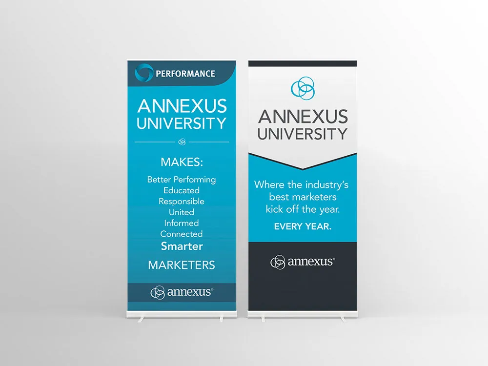
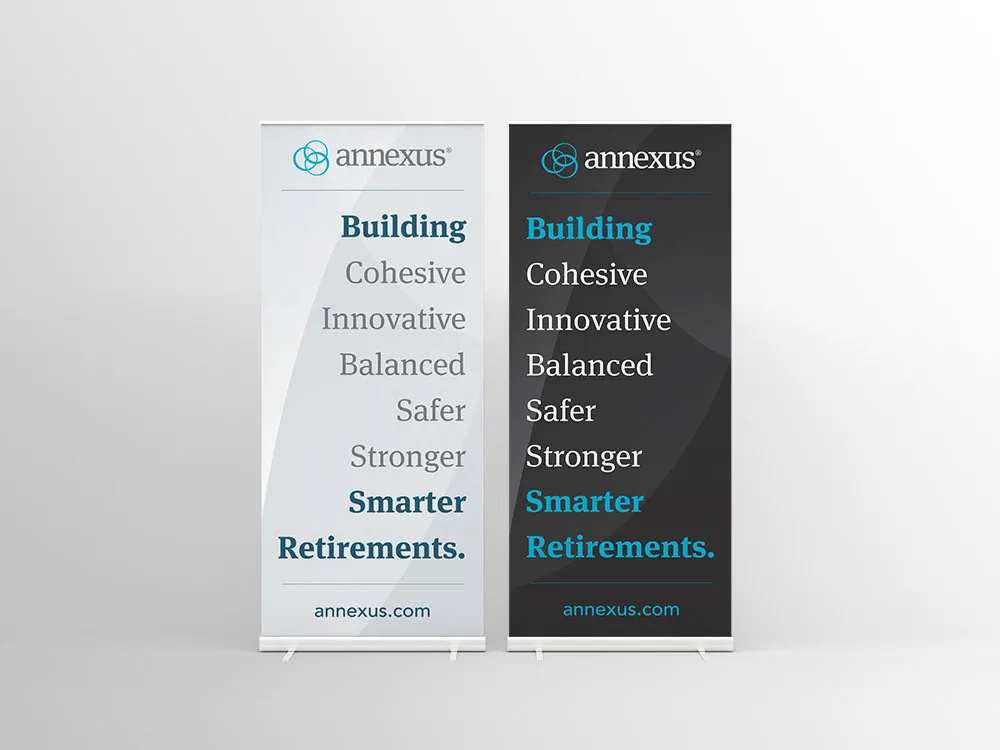
- Event Stage & Environmental Graphics
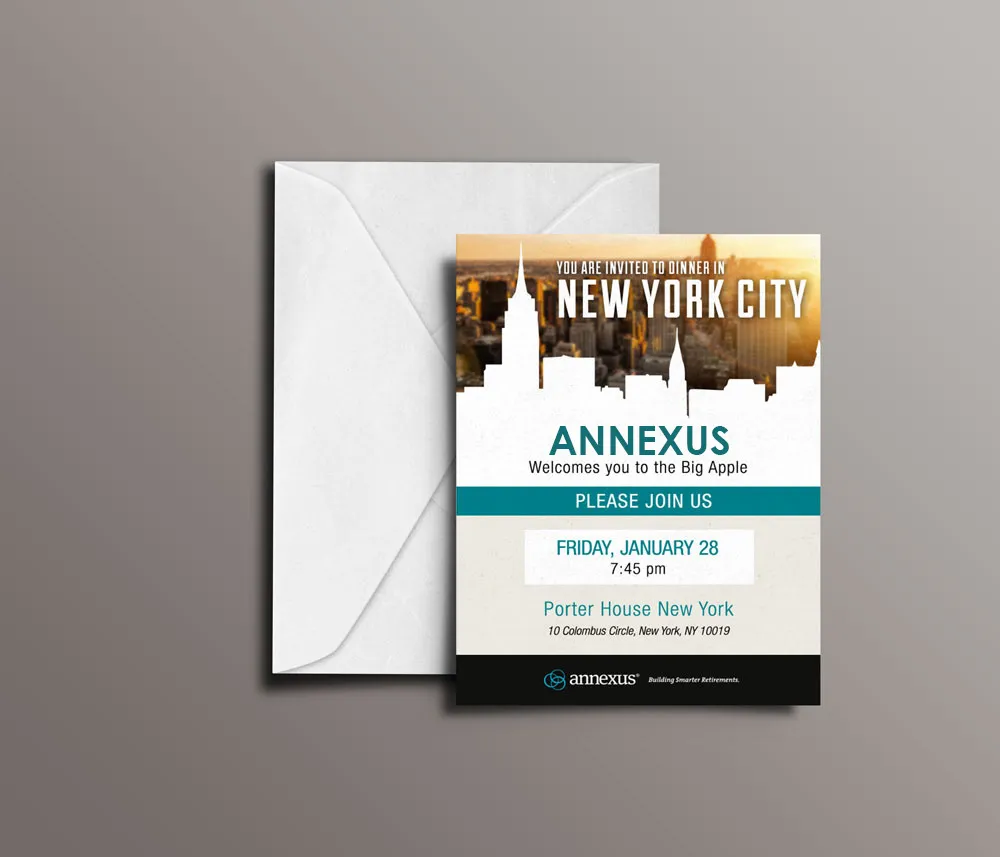
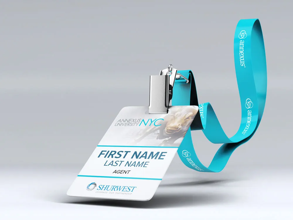
- Institutional Sales Collateral
- Financial Data Visualization
Outcome & Impact
Modernized the educational conference experience, enabling keynote speakers to deliver complex financial narratives with visual clarity and high audience engagement.
Tools & Formats: Keynote Presentation Decks · Event Stage & Environmental Graphics · Institutional Sales Collateral · Financial Data Visualization
Project Visuals & Rollout
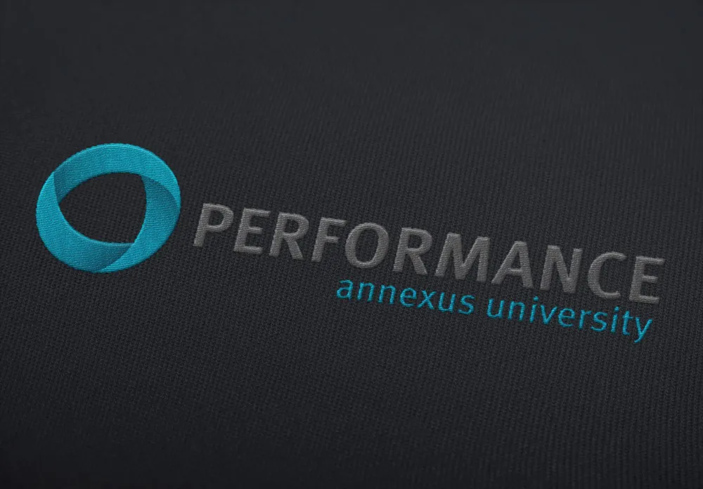
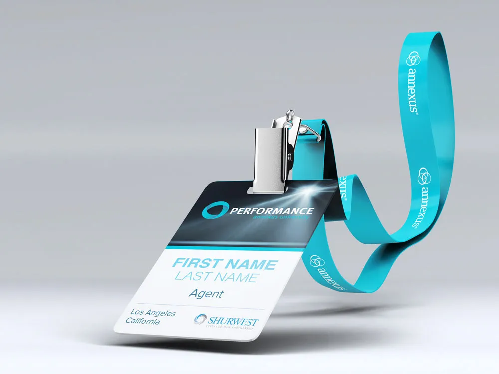
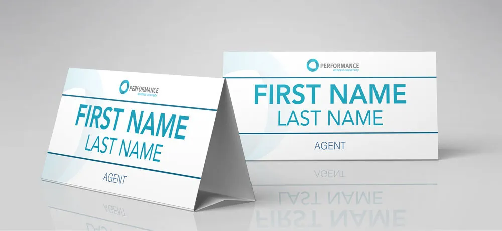
A comprehensive visual sequence of campaign assets, in-store touchpoints, sketches, and finished deliverables.



More for Annexus

Nationwide & Annexus Partnership
Executive presentations, institutional sales enablement tools, and product literature developed for the Nationwide and Annexus partnership.

Athene "Elevate" Launch
High-stakes nationwide financial product rollout combining bold key visuals, advisor sales collateral, and multi-channel marketing.

Responsible Performance BMW i8 Giveaway
High-touch luxury incentive campaign combining sleek automotive aesthetics with disciplined promotional mechanics.
Adjacent projects navigation
Need an executive presentation or sales storytelling deck?
Suited to dense material where the audience needs clarity and a reason to keep reading.