
Logos
A curated collection of custom logo marks, monograms, and typographic emblems created across retail, automotive, corporate, and lifestyle sectors.
Brand Systems & Identity
Logos and guidelines a team can actually use every day.
Identity Craftsmanship
Brand identity balances personality with functional durability so marks remain distinctive at the reveal and versatile in everyday corporate application.
Project Details
Amanda's Role
Amanda led creative concepting, vector mark design, custom letterform drafting, lockup variations, and reproduction guidelines across retail, financial, event, and service clients.
Challenge & Focus
Creating identity marks that convey immediate personality while remaining structurally versatile across extreme production environments—from 16-pixel digital favicons and embroidered uniform patches to 15-foot exterior signage.
- Vector Mark & Monogram Crafting
- Custom Lettering & Logotypes
- Primary, Secondary & Badge Lockups
- Single-Color & Embroidery Formats
- Brand Usage Guidelines
Creative Concept & Execution
Form, Meaning & Production Precision
A strong logo mark does heavy lifting with minimal geometry. Whether designing the outdoor-ready badge for Arcadia Trail, the spirited script for Doggie Day Camp, or the industrial emblem for GKS Auto, each mark is engineered to tell a clear brand story before words are even read.
Every concept is stress-tested across single-color screens, dark and light backgrounds, and dense print substrates to ensure lines never blur and silhouettes remain unmistakable in the real world.
Outcome & Impact
Delivered an enduring portfolio of identity marks engineered for high visual recall, instant recognizability, and reliable production consistency across physical and digital mediums.
Tools & Formats: Vector Mark & Monogram Crafting · Custom Lettering & Logotypes · Primary, Secondary & Badge Lockups · Single-Color & Embroidery Formats · Brand Usage Guidelines
Project Visuals & Rollout
A comprehensive visual sequence of campaign assets, in-store touchpoints, sketches, and finished deliverables.

More in this discipline
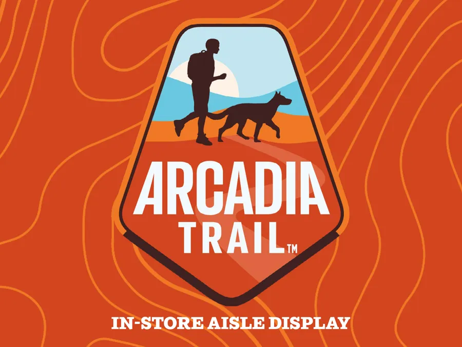
Arcadia Trail
Adventurous outdoor pet gear brand identity, packaging system, and visual guidelines developed for PetSmart's performance line.
GKS Auto Repair
A rugged, vintage-inspired visual identity and collateral system for an independent automotive repair shop.
Adjacent projects navigation
Looking to refresh your brand identity or visual system?
Reach out to commission a custom logo mark, comprehensive identity system, or brand refresh.